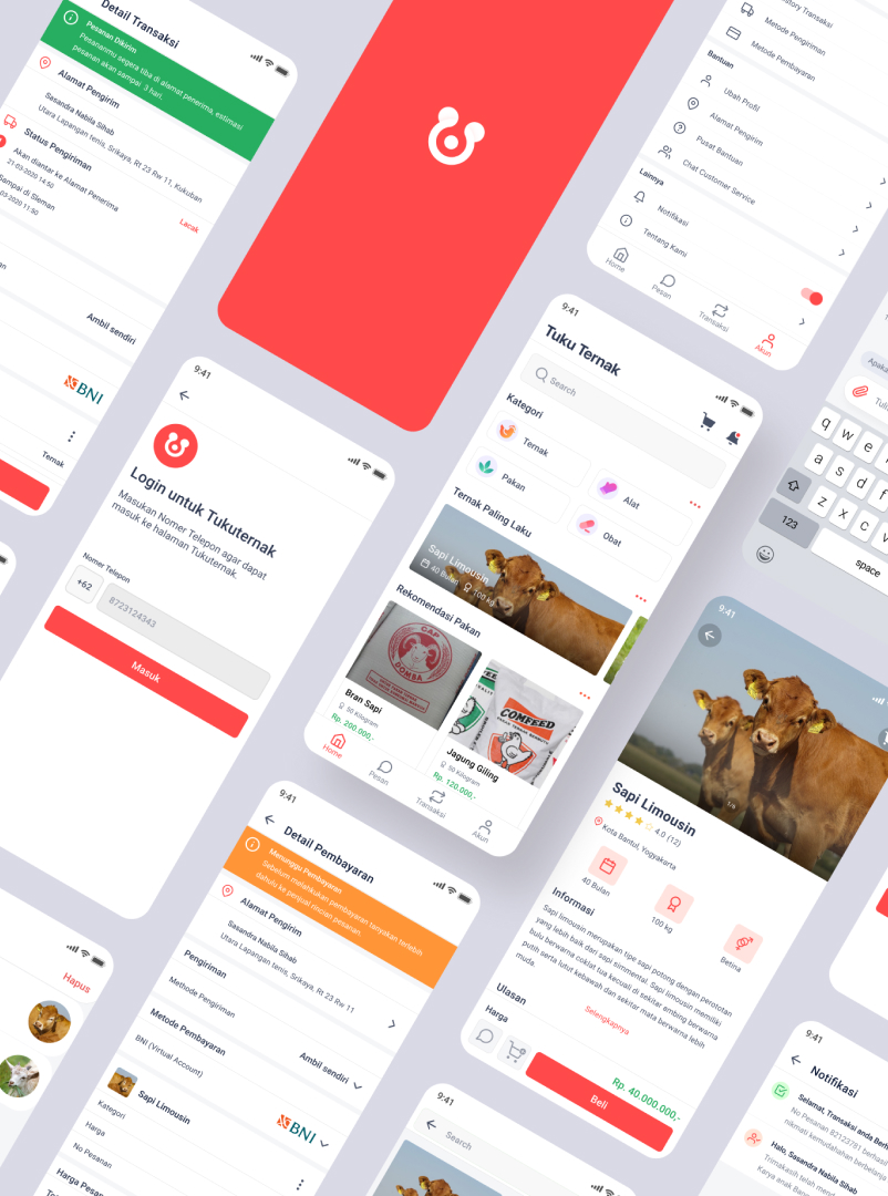
Tuku Ternak
Services
App Design & Development
Platform
IOS / Android
Tools
Figma and Flutter

🤔 The Problem
This is a mobile application design developed by my team, as a designer I have to prepare content and design well. The purpose of the tukuternak is to contribute to the welfare of Indonesia by helping:
- Farmers find it difficult to sell livestock directly when the harvest season arrives.
- Breeders sell to middlemen at a lower price and in the end the farmers end up losing money.
- One example is cattle breeders, 68% of cattle fattened by approximately 5.7 million cattle breeders cannot be sold in the domestic market. Rantai distribusi ternak yang kurang efisien.
- Inefficient livestock distribution chain.
- Market access for farmers is limited because farmers rarely sell directly to large retailers.
🧑💼 The User & Audience
As I mentioned above, Tukuternak is an application that is engaged in livestock e-commerce (selling various livestock products) that applies business concepts and empowers farmers and MSMEs. Because our application is intended to help small farms, we carry the tagline “Solution for small farms”. Our application will provide a Market place for small farmers who are having trouble finding a market.
🤝 Scope & Constraints
This design process gave me a time-tested and trusted way to do a good job, sometimes linear as it seems, sometimes zig-zag. Sometimes I build something completely new.
🧩 Design System
Sitemap
The first step I took was to look at brands from other competitors because I think to get maximum results I have to look for as many ideas as possible. This sitemap is very useful to see how much coverage and as my guide in designing pages. I created a sitemap view using a tool from Figma Figjam. The next process is to create Wireframing.
Mobile app for inspiration
When I started designing I looked for mobile application inspiration, starting from competing brands or on the internet. Tukuternak is a buying and selling product similar to Bukalapak, Tokopedia, Shopee, etc. I found the visualization good as expected of the product. I selected several inspirations with the same approach.
I found a web tool to find real application inspiration, like mobbin and uisources this application is really helped me in finding a complete, good, and cool design, especially for mobile app designs.
Wireframe
After the Sitemap is complete and approved I proceed to the Wireframe process. I use the content of the layout I created to present the content, so I know how the page will look. Wireframes are very important because they make the client focus on the content first. This is a Wireframe image that I created using the Figma tool.
Defining Colors and Design Elements
Determining the colors and design elements must research what I use, I also compare with designs from competing brands, because it helps in finding “Keywords” for me to research again. The color describes the brand tukuternak. You can see documentation of this tukuternak design at Figma – Tuku ternak.
Icons
I made my own icons using Figma and Adobe Illustrator. I modified the icon from free icons on the internet such as iconify, that way I can make icons according to the tukuternak theme.
Mockup
After I finished creating the Sitemap and Wireframe I started making mockups, this mockup uses mostly layouts from wireframes. The combination of colors and design elements I made into a beautiful and interactive mockup. Fill in the image, create some design elements to emphasize the meaning of the site, add color and enhance the layout.
Prototype
The last step of the Design System is a prototype, this prototype helps me to click on a predetermined link so that it gives the impression of a ready-made application. I myself use tools from Figma and Figma mirror for mobile devices. On the prototype I can provide various interactive animations, this prototype also helps me in design demonstrations, in Figma I just share a link to be executed/tested by the design testing team.
🤔 User Testing
Before this tukuternak design, there are still steps from testing the feasibility of using the application in the hands of the user in the form of a document that can be used as evidence that this application can be accepted by the user.
I use maze to analyze how the user uses this tukuternak application, starting from analyzing the user pressing buttons, navigation, images, etc. Using maze I can give everyone a link for application testing purposes.
🏆 Result
From several feedbacks and revisions from my friend, this tukuternak design is finally finished. The next step is the android and ios development process, I use the Flutter SDK made by Google. I use Flutter because of its Fast Development, Expressive and Flexible UI, and Native Performance.
Please check the tukuternak Flutter Mobile Development button below!!! ️ 🤩
